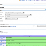
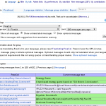
I’m not a designer. Yet, I am a designer. During the many years of development of the Translate extension, I have done about all things related to the development of a software project: coding, translating, documenting, testing, system administration, marketing and user interface (UI) design among those. My UI design skills are limited to personal interest and one university course. But I try to pay attention to the UIs I create, and I listen for feedback. For once we got some good feedback about the issues in the current UIs and some suggestions about how to improve it. Based on this feedback I have done two significant changes to Special:Translate – the main translation interface of the Translate extension. The first significant change is to split the page into a few different tasks: translating, proofreading, statistics and export. I implemented these as tabs. Typically the user starts from language statistics and selects the project he wants to translate or proofread. This has the following benefits:
- The tasks are clearly separated: users can see at a glance what are the things that can be done with the intreface.
- Switching between tasks is seamless: previously there was no easy way to go back to language statistics from translating or proofreading.
- There are less visible options at a time: the UI just looks nicer and takes less space.
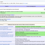
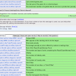
The second change is an embedded translation editor. This feature is still in beta phase, and if we get enough positive feedback about it, we will switch over from the old popup based editor. You can test the editor by going to Special:Translate and double clicking the text you want to translate. This should prevent the hassle of moving and resizing dialogs. On the other hand it has some problems with the editor moving on the screen when you advance to next message, and it also stands out worse in the middle of the surrounding context. I’m investigating if and how we can mitigate these issues. I’ve already changed some stylings to make the editor stand out more and the whole table appear less heavy. As a bonus the embedded editor feels faster, because I’ve added some preloading. This means that when you save your translation and go to the next message, it will show up instantly because it has already been loaded.
- Old interface
- New interface
- Popup editor
- Embedded editor


